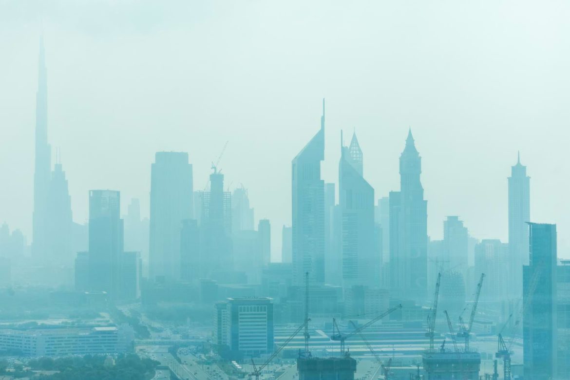
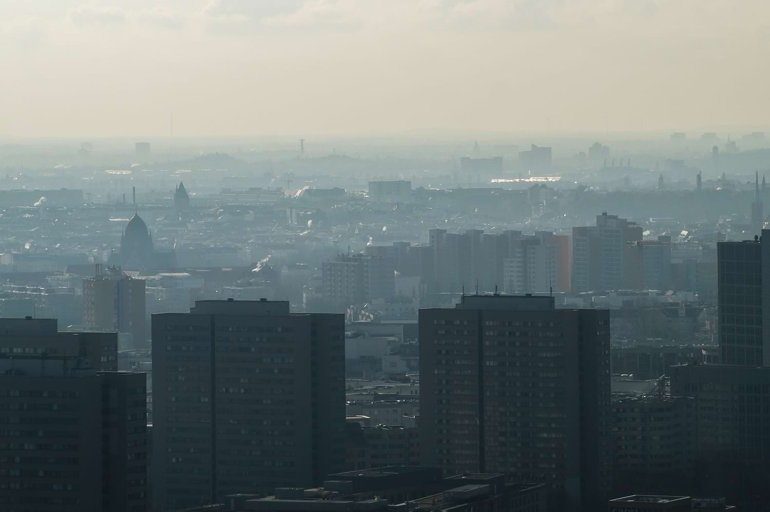
In the past, checking the weather required turning on the radio, watching television broadcasts, or simply stepping outside. Today, we have an abundance of real-time tools at our disposal. A simple internet search gives us access to weather maps that update every few minutes. These tools provide detailed forecasts that include temperature, wind speed, precipitation, and even storm tracking. However, alongside weather monitoring, another essential system has gained prominence: the air quality map.
The air quality map is a powerful digital tool that operates in much the same way as weather maps. It draws from numerous sensors placed across entire regions, countries, or even continents like Europe. These sensors measure specific airborne pollutants in real time, such as particulate matter (PM) of various sizes—PM1, PM2.5, and PM10. By compiling and displaying this data in a visual and accessible format, the air quality map offers critical information about the safety of the air we breathe.
This technological advancement has become an integral part of environmental awareness and personal health management. The increasing availability of such maps online has changed how people interact with their environment. With just a few clicks, anyone can now see the concentration of harmful pollutants in their city or town, allowing for more informed decisions about when and where to go outdoors.
Understanding What Air Quality Maps Show
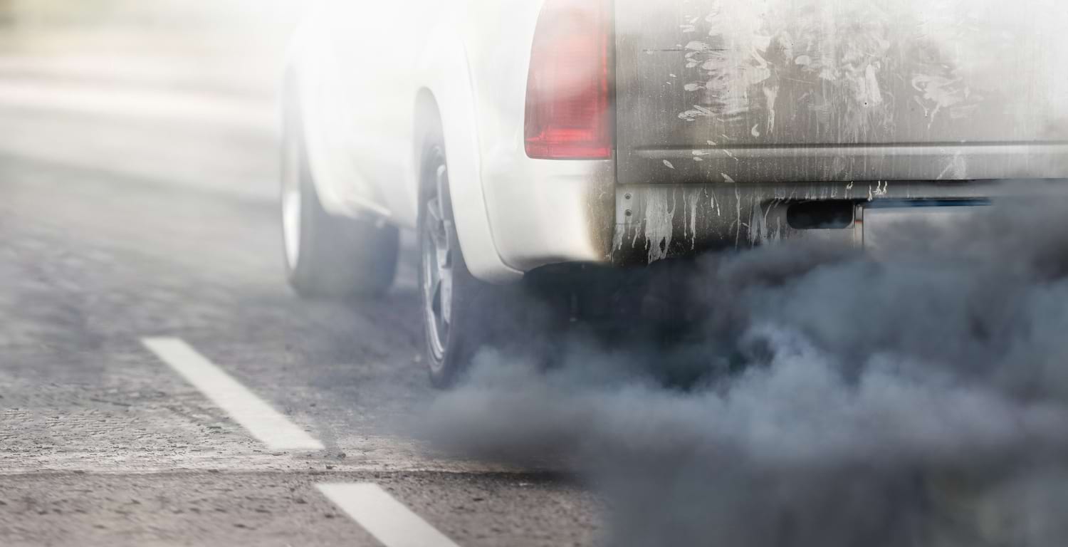
An air quality map typically presents data collected from multiple air monitoring stations, often categorized by pollutant type and level of concentration. The most common pollutants tracked are PM1, PM2.5, and PM10. These numbers refer to particulate matter sizes measured in micrometers. PM10 includes particles up to 10 micrometers in diameter and can include dust, pollen, and mold. PM2.5 consists of finer particles such as those from car exhaust and industrial emissions, which are small enough to penetrate deep into the lungs. PM1 particles are even smaller, often originating from combustion processes, and are considered particularly dangerous due to their ability to enter the bloodstream.
Color-coded scales are frequently used to help users quickly interpret the data. Green may indicate clean air with minimal pollution, while yellow, orange, red, or even purple indicate increasing levels of danger. When smog levels are high, the map might show widespread areas in red or purple, alerting users to avoid prolonged outdoor exposure.
The Health Impacts of Poor Air Quality
Poor air quality is not just an environmental issue—it is a direct public health concern. According to the World Health Organization, air pollution is responsible for millions of premature deaths each year globally. Exposure to fine particulate matter has been linked to respiratory illnesses like asthma and bronchitis, cardiovascular disease, strokes, and even neurological disorders. Long-term exposure can reduce life expectancy and lower the quality of life, even for people who appear otherwise healthy.
Children are particularly vulnerable. Their developing lungs and higher breathing rates mean they absorb more pollutants relative to their body size than adults. Elderly individuals and those with pre-existing health conditions also face heightened risks.
Air quality maps help mitigate these dangers by allowing people to monitor and avoid high-pollution areas. For example, parents can use such tools to decide whether it’s safe for children to play outside. Runners or cyclists can check pollution levels before heading out for exercise. Schools, workplaces, and public health agencies can issue alerts or recommendations based on real-time data, helping to protect large populations during periods of poor air quality.
Why Widespread Access to Air Quality Maps Matters
Access to a reliable air quality map empowers individuals and communities to take control of their health. Informed decision-making is a crucial step in reducing the personal and societal impacts of air pollution. For instance, on days when pollution levels are high, individuals might choose to commute via public transportation rather than driving, helping to lower emissions. Cities might implement temporary traffic restrictions or recommend limiting industrial activities to reduce smog.
Moreover, air quality maps contribute to greater environmental transparency. They provide a means for holding polluters accountable, especially in areas where industrial activity or traffic is a significant source of airborne contaminants. Citizens and environmental organizations can use historical and current data to advocate for cleaner practices and stricter regulations.
Schools and universities are also incorporating air quality awareness into curricula, using data from these maps to educate students about environmental science, public health, and civic responsibility. This fosters a new generation of environmentally conscious individuals who understand the tangible effects of pollution on daily life.
Author Profile

Latest entries
 TourismMarch 27, 2026The Operatic Soul within the Private Sanctuary
 Health & BeautyMarch 9, 202624 Inch Hair Extensions: How to Achieve Red-Carpet Length and Volume
 Health & BeautyFebruary 16, 2026The “Quiet Luxury” Hair Guide: How to Achieve Seamless Volume with Luxe Hair Extensions
 Health & BeautyFebruary 9, 2026What Does a Medical Scribe Actually Do? A Comprehensive Guide to Responsibilities and Skills